With a brand-new academic year approaching, Fosters Schoolwear needed a brand-new website to match! Something fresher, easier-to-use and more informative for customers. That’s where we stepped in to help.
The problem
As one of the leading suppliers of school uniforms in the UK, the Fosters website had to cope with a huge influx of traffic (around 30% of their sales were made online).
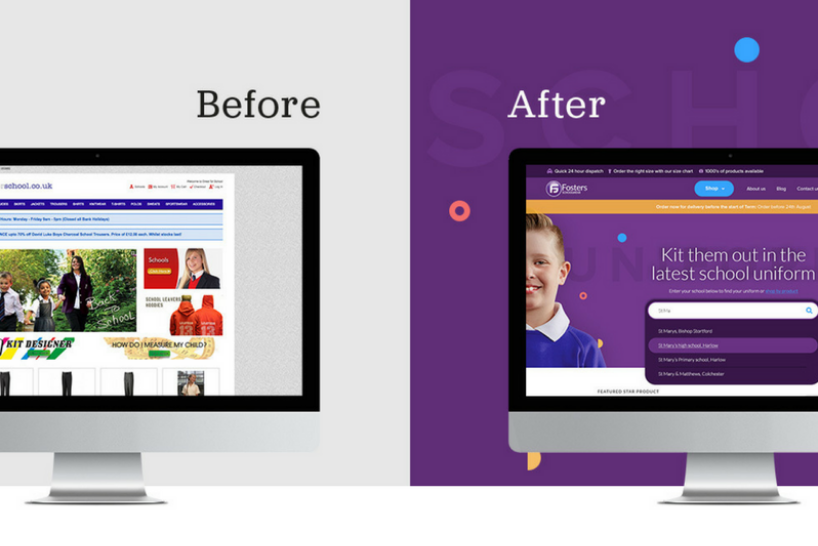
Unfortunately, the old site made it extremely tricky for people to purchase products; the search functionality wasn’t efficient, it lacked clear sizing information and had an outdated design. As a result, people bypassed the website and went to the company’s physical store in Bishop’s Stortford instead. This put a tremendous amount of strain on staff during busy months, making it harder for them to provide personalised and thorough customer service.

The solution
Rubber Cheese was tasked with revamping the website to make the overall shopping experience more pleasant. We aimed to improve the customer journey, modernise the design and refine the content. We wanted to build a website that truly reflected Fosters’ USPs: Service and speed, next-day delivery, exceptional product quality and a straight-talking approach.
The website
We completely redesigned the website to make it fit for purpose; we introduced a feature rich e-commerce system to manage, promote and sell products online (WooCommerce), an advanced and synaptic filtering functionality, intelligent sizing tools, a dedicated customer account area, email system, CMS system and responsive new page designs. Yes, we’ve been busy!
Search functionality was a major priority for us as the former website required customers to trawl through hundreds of products to find what they wanted. We made it easier for them by including a search by school function as well as clear options to filter by colour, gender, price and size. As well as this, we’ve highlighted popular products on the homepage, related items alongside product listings and decluttered the content to make it easier-to-navigate.

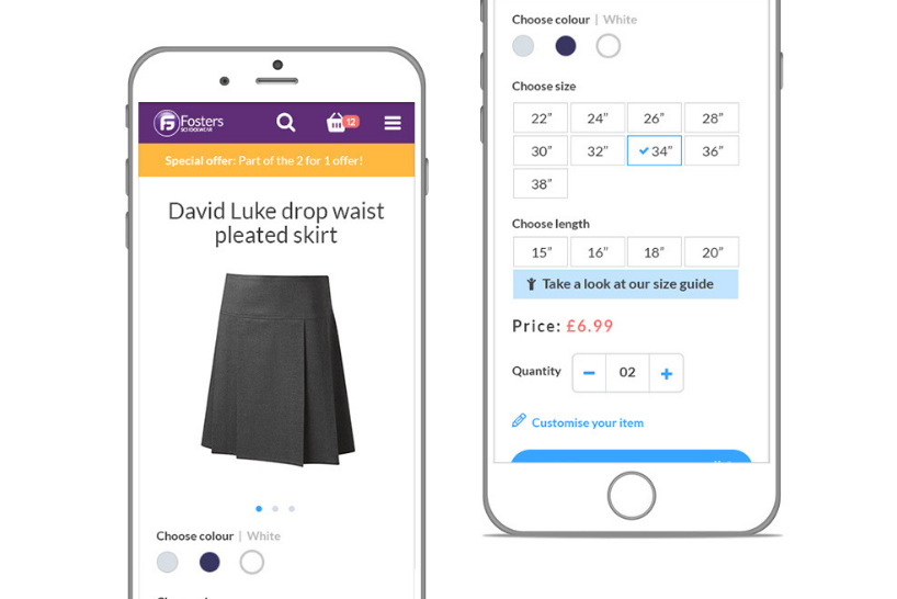
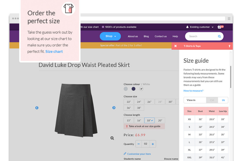
Finding the right fit was a major concern for customers; if they couldn’t locate this information, they were liable not to purchase anything. To build their confidence in buying, we provided easy-to-locate size guides throughout the site, including alongside each product listing.
57% of users say they wouldn’t recommend a business with a poorly designed mobile site; basically, poor mobile performance leads to frustrated customers that go elsewhere. Consequently, when designing and developing the new Fosters site, we took a mobile-first approach.

The design
School should be cool, not stuffy! However, we felt the old website didn’t embody this more modern approach to learning. We decided to completely overhaul the design to show education as engaging, exciting and exploratory.
We decided to bin the conventional book-bag blue and go for something a little more lively – a vibrant purple (a colour that encourages imagination and creativity). We’ve peppered this with splashes of orange, blue and red, mainly to highlight key information but also to develop a playful quality throughout the site.
The use of stylish icons, which act as visual signposts for customers, also makes it easier for users to locate their desired products. The updated typography is consistent; the contemporary and clear text overlaps fun images and makes for more visually appealing pages.
As mentioned earlier, it was important to us that we reflected Fosters’ USPs. To achieve this, we positioned them distinctly at the top of the page and reiterated them throughout the site.
These reminders alongside a mega menu style navigation, combined with the school search function, promise to improve the customer’s shopping experience considerably. Now, people can find specific items quickly and rest in the assurance that they’re going to receive the best possible service and products.

Final thoughts
It was a pleasure to work with Fosters Schoolwear on this project. Rubber Cheese’s Creative Director, Paul Wright, added:
“Fosters have been an absolute pleasure to work with, they took on board our suggestions and have really been involved in the whole process.
It’s been a real team effort and we’re really happy with the end result. We can’t wait to see the positive effect the new website will have on their business and customers moving forward.”
To view the website, visit Fosters Schoolwear. Alternatively, follow them on Twitter or Facebook.

Related articles
Digital
We developed a sensory guide for Eureka! The National Children's Museum
Announcements
Welcome onboard BW
Announcements
Rubber Cheese selected by THIS.