Successful web design for visitor attractions that want to sell more tickets: an overview of the Rubber Cheese approach and case studies
Specialising in web design for visitor attractions and tourist destinations means we’re lucky to partner with a wide remit of exciting organisations, from aquariums, nature reserves, historic houses and museums.
Our goal is to create engaging websites that improve conversions, save resources and ultimately increase ticket sales for visitor attractions. We do this by working in partnership with our clients, running discovery workshops to understand their business, audiences and unique ways of working.
It’s our role to immerse ourselves in your brand, research the requirements, but most importantly – listen and learn to enable us to deliver a website that delivers on all your objectives, and more.
As a company our vision is to “Make a positive change to the global visitor and tourism attraction market. Improve how visitor attractions interact, engage and delight their guests online so they deliver a better, more enjoyable and accessible experience.”
We love the visitor attractions sector, so much so that we’ve developed a free ebook full of digital strategies, an annual visitor attraction website benchmarking report and developed a leading attractions sector focused podcast, Skip the Queue. We surround ourselves with industry inspiration every day so that our clients benefit from an extended understanding of their challenges and focuses.

Our customer focused approach helps us create clear navigation structures, layouts and user interfaces that are not only great to look at, but easy to navigate so users can find content quickly and in different ways. And we design and build websites for performance, not just visuals.
We often take a mobile first approach when it comes to website design, based on data driven decisions. Insight from our visitor attraction website report tells us that 65% of users will interact with your website on a mobile device.
This plays a huge part in the user experience of the booking journey, something we see ourselves as experts in. Many websites are “mobile friendly”, or responsive – they scale to the size of the device you’re viewing them on. Our approach for the booking journey is to design the journey to the device – removing distractions and making buttons bigger etc.
Working with visitor attractions means we are often involved in complex integrations of booking systems via their APIs. We have extensive experience of working with Access Gamma, Merac and a number of other platforms such as DigiTickets and Maxim.
To ensure usability, we use best practices such as intuitive navigation, clear and consistent layout, defined calls to action and responsive design to make the website accessible on different devices. We also conduct usability testing to discover if users have succeeded to use the product or service we’re working on.

Case studies
We help leading attraction and destination brands like Holkham, Pensthorpe and The National Marine Aquarium, stand out online and get more people to visit.
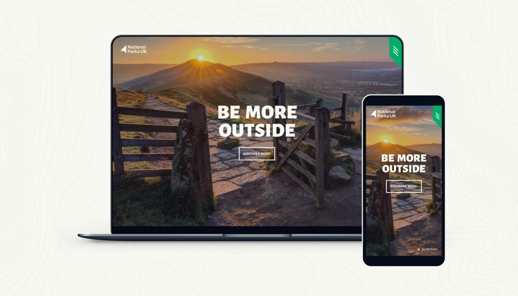
National Parks UK set us an exciting challenge to develop a site to help inspire people from all walks of life to immerse themselves in their local landscape and explore the National Parks on their doorsteps. Showcasing the Parks’ incredible landscapes and the breadth of activities that can be carried out within them, helping everyone to be more outside.
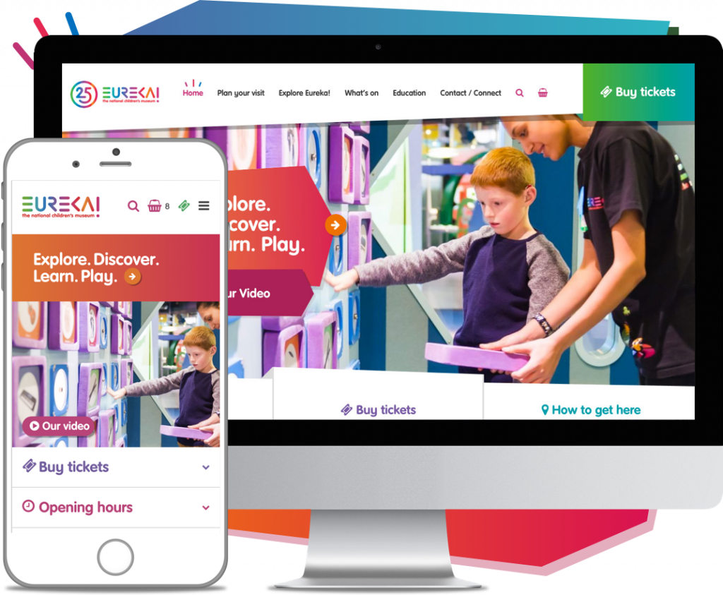
Eureka! The National Children’s Museum challenged us to improve two of their key assets, their website and clunky, paper based annual pass system. We were initially contracted in 2016 to produce a new revenue generating WordPress website, with ecommerce capability and Gamma API integration, plus a bespoke annual pass solution.
Our relationship with Eureka! continues long past this initial project, recently launching the Eureka! Science + Discovery website for their new visitor attraction in Wirral.
“Our relationship with Rubber Cheese is now in its 5th year, and we like to think that we’re going steady. From initial pitch back in 2016, through to launching our latest site with them, they’ve been head and shoulders above other agencies I’ve worked with over the last couple of decades. Along the way they’ve developed our main website, complete with online bookings and a digital pass system, they’ve created an online sensory guide for people with sensory conditions, a dedicated schools website and more.
When looking to create a brand launch site for our new attraction opening in 2022:Eureka! Science + Discovery, which will need to morph into a visitor attraction website, there was never any doubt that we would go to the Rubber Cheese team.”
Sophie Ballinger, Head of Communications & Customer Service
Want to see how we can support your visitor attraction?
Book a call with me today and let’s see where we can take your organisation!
Book a call with Kelly
Related articles
Announcements
2022 Visitor Attraction Website Report
Announcements
Rubber Cheese launches new website for Pensthorpe
Announcements
Rubber Cheese launches new website for Holkham