ACCESSIBLE DESIGN

Making the
Eureka! experience
accessible for all

How we worked with Eureka! to produce a digital sensory guide to help visitors with sensory conditions prepare for their visit.

The challenge

Eureka! asked us to create a highly responsive and easy-to-update microsite packed full of information, images, videos and sounds to help visitors with sensory conditions prepare for their visit.

Accessible design

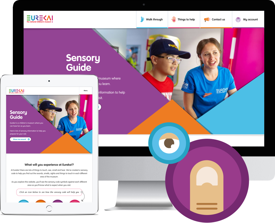
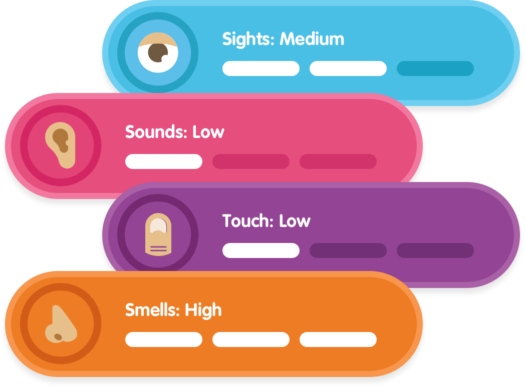
The microsite is highly visual with plenty of engaging images that represent the museum’s physical experience. As well as this, we included smooth transitions between pages and large, easy-to-read copy. We also used autism-friendly colour coding to explain the sensory feelings and used fun icons to spark excitement.
Comprehensive research

Our team carried out in-depth research into pain points for users with sensory conditions and worked closely with Eureka! to fully understand what information their guests valued most. From there, we identified must-have content and got rid of anything that wasn’t necessary - every piece of copy and media is precise and serves a purpose.

Easy-to -update

We gave as much control as possible to the Eureka! team so they could easily provide guests with the most recent information. To do this, we developed the guide in WordPress and made copy, images and videos editable.

Mobile first

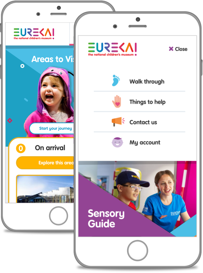
It was important for the guide to be accessible on-the-go – so, taking a mobile-first approach, we developed a highly responsive website that's available and readable across all devices.

Navigation

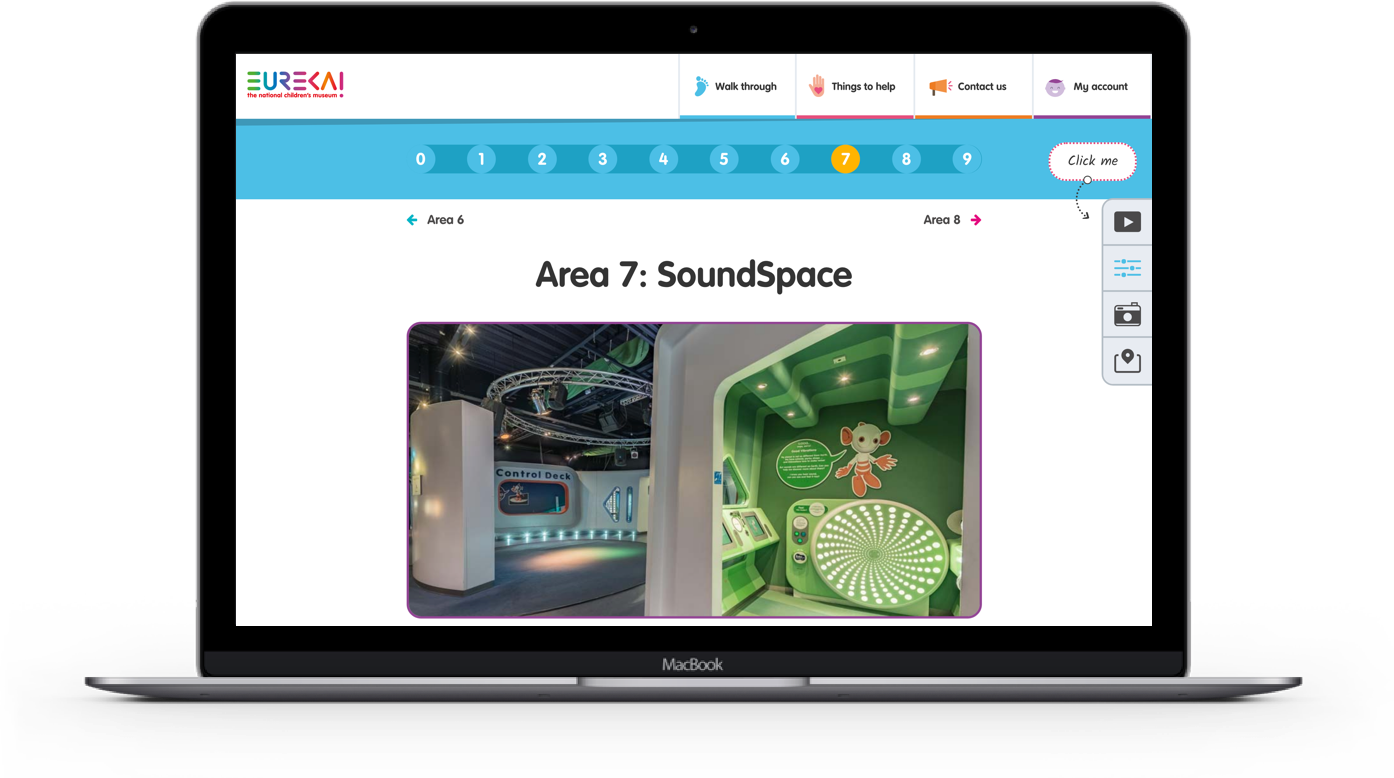
We developed a logical, step-by-step navigation which reflects how guests would walk through the museum, explaining exactly what they’ll see, hear, smell and touch along the way. By following the guest’s trajectory, the guide can be used intuitively as they move through the venue.

Testimonial

“The Rubber Cheese team obviously take a lot of pride in their work and are driven to produce excellent results for their clients.”

“It never feels as though their projects are “just a job” to them. With our sensory guide – as with our other projects with them – they WANTED to take the time to understand the challenge, research what’s out there, look for trends and best practice, add their creative flair and – most importantly – make sure that the resulting website does exactly what it was designed to do. Thanks for another excellent website!”

Sophie Ballinger
Communications Manager
Eureka! The National Children’s Museum