The term ‘web design’ leads you to believe that design is the most important part of the build process. You ask for a site, designs come back and then it is built – easy right?
Not at all! We’ve spent years perfecting our development and wireframing process to ensure the best outcome for the client. We prefer a longer planning stage before any designs are made, which includes putting a large emphasis wireframing the site.
This post walks you through the whole creative process, from mood boards and content structures to wireframing and the final design process. Each element relies upon the one before it and wireframing is the backbone for it all.
Moodboards – what happens before wireframing
Before wireframing and design, it’s important to get a feel for what the client wants. We start by getting to know you, by doing research and creating mood boards based on what we find. This helps us to flexibly present a number of ideas and involve everybody in the design process – it’s good fun too.
Mood boards help us to find fonts, styles, colours and icons you like, and importantly the ones that fit best with your industry and company.
Our competitor analysis helps us to learn about what makes your customer tick, and how we can level up against your rivals. We look at their photography, navigation, user interface and other elements like forms and search boxes.

Deciding the hierarchy of content
Once we’ve got sign off from you, we look at the hierarchy of the website. This is the process of defining the most important content on the website in order to show the audience the right messages and signals.
During this process, we look at each page and define the most important sections of each part of it. Special offers or delivery information may need to be front and centre of the home page, or maybe it is testimonials and contact details if you’re a service-based company.
We take this information and decide what size, colour, alignment and style each of these important elements should be. This information is vital to wireframe the site, which also helps us inform the design we do later.
What’s wireframing?
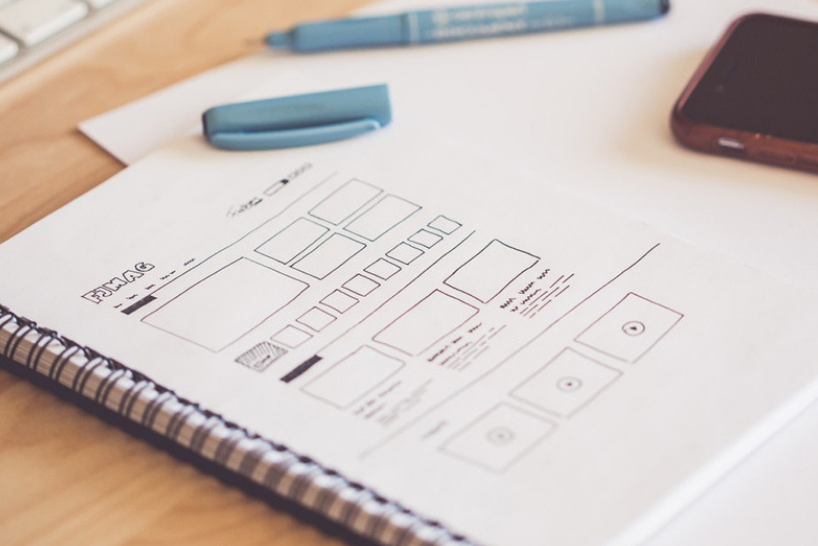
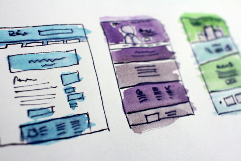
A wireframe is a visual representation of a website as a sketch showing:
- Basic page layout
- Structure
- Navigational structure
- Major components – web forms, sliders, advertising banners
- It shows where design elements will go, although won’t show any finished design as we concentrate on the structure first.
Wireframes help to focus the project and provide the most effective website which takes into account all our previous research. It is a vital process and without it, you will have a confused web team, an under-informed client and in the end a messy website.

Wireframing achieves the following essential goals:
- Defines the page structure and layout
- Tests and refines the navigation
- Organises the content layout
- Develops the user interface for web forms and interactive components
- Benchmarks the layout against usability best practices
- Highlights essential and additional development or programming work required
One crucial aspect of wireframing is responsiveness, and we create wireframes for tablet and mobile size too. A third of all internet browsing is via mobile, and two-thirds of adults own a smartphone, so it isn’t a small consideration anymore.
Wireframing for mobile and tablet allows users to plan how page elements will move and resize for the user, and if content should be redistributed for best effect.

Case study: Herts Fullstop
We were approached by educational supply retailer, Herts Fullstop, to revamp their e-commerce site and do a full rebrand. Their audience of busy school staff and teachers meant that products had to be easy to find, special offers had to be prominent and the search function very robust.
Wireframing helped us to lay these elements out according to their importance, and show the client what they could expect from the final design.
The header forms a key part of the user experience – showing the search bar, user sign up, user login and customer support as well as the vital ‘quick order’ function. This stays at the top as you scroll through the site too.
The menu is very simple, with just one menu dropdown for the shop; everything else is accessible with just one click. This decision was based on their busy audience, everything essential had to be always available.
There is a lot of content packed into this website, and without a well-researched wireframe at the helm of the project, it could have easily become unachievable. We’re proud to say that we made this complex project a success for both client and customer!
Visit the site to see our work, or visit our portfolio page to see the variety of projects we’ve done.
Why wireframe?
Efficiency in design
Web page design takes time and effort and needs to be undertaken in an informed way. Wireframing allows us to take control of the design process to ensure it is completed in good time and without costly design changes in the future.
Optimising site navigation
A wireframe gives you a ‘test run’ for the navigation, even though the site isn’t built yet. It can be so easy to see when the navigation is incorrect, but hard to get right without the right planning in the beginning. Wireframing ensures all the menus, key pages, calls to action and design elements flow properly and provide a good user experience.

Guide the web development team
A clear wireframe provides solid directions for developers, cutting down questions and assumptions that can slow down the build process. It makes everyone a lot happier, we can assure you!
Sets the final structure
The wireframe is used by everyone – designer, developer, account manager and client – and provides an accessible point to assess the final structure of the site. Everyone knows where everything goes and what is expected of the site. Before we do any design or development we make sure everyone is happy with the wireframe, it is the foundation of your website!
Designing and building website
After the wireframing process, we move onto the design stage. We produce just one concept for you, just one! Yes! All of the work we’ve just done means we can be confident in the design we produced because it is based on research and evidence.
Once the design is signed off and any changes made the content needs to go in, which includes copywriting. We do ask you to think about this in the beginning, but we know it can be tricky until you’ve seen what you have to work with. We can also help you with your copywriting, just ask!
We’ll agree at the beginning who’s responsible for copy and content (this includes photography or product information) so we can all be prepared.
Once all of the above has been signed and sealed, it is time for our development team to get stuck in! They’ll transfer the design and content into your new website, and strap it into a content management system (CMS) that means the website can be updated on an ongoing basis. Your website has now come to life!
Are you sold on wireframing? We believe it is the best way to work and ensures the best outcome to achieve your expectations.
Get in touch with us to see what we can do for you.
Related articles
Digital
The dos and don'ts of working with a creative agency
Digital
Five benefits of using small digital agencies
Strategy
Receive a free personalised digital strategy guide to transform your customer’s online experience