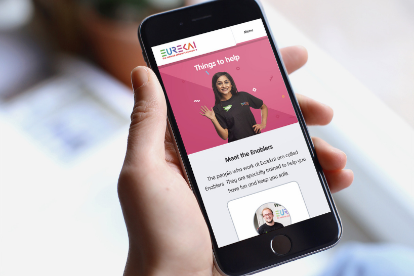
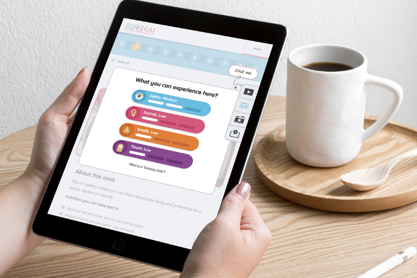
We had the pleasure of working with Eureka! The National Children’s Museum to develop an online sensory guide following UX accessibility best practices. In this blog, we’re taking a look at the process in more detail.
The client
Our lovely client Eureka! isn’t like other museums (and we’re not just saying that) – they’re the only fully interactive museum totally dedicated to children aged 0-11 anywhere in the UK.
Innovators in the attraction industry, they’ve used the latest technology and concepts to create over 400 hands-on, engaging and educational exhibits designed to inspire enquiring minds.
It’s a truly vibrant and colourful place that attracts hundreds of thousands of visitors each year.

The challenge
The colours, activity and excited chatter are part of the Eureka! experience – but so is inclusivity and ensuring the museum is as accessible as possible for all families.
Eureka! understood their environment could be particularly overwhelming for guests with autism or sensory conditions.
So, led by their Inclusion Manager, Trizia Wells, and Inclusion Enabler, Lorraine Muldoon, they developed a variety of solutions including autism awareness training for employees, ear defenders and a Chill Out Room.
They also collaborated with their visitors with autism to produce an in-depth sensory guide – this provides all the information a guest needs to properly prepare for their visit.
But Eureka! knew they could go one step further. Up until now, the sensory guide was only available via leaflet or PDF download, which made it tricky to amend. To ensure they were always providing the most up-to-date information, they wanted to develop an editable and easy-to-use online version. Cue Team Cheese.
Our goal
Our goal was to introduce accessibility in user interface design to create a highly responsive and easy-to-update microsite. It needed information, images, videos and sounds to help visitors with sensory conditions prepare for their visit. It had to be straightforward, emotionally intelligent and accessible for teachers, group leaders and children with sensory conditions and their parents.

How we did it
Easy-to-update
One of Eureka’s main challenges with the sensory guide was its limited format – it was time-consuming and difficult to update, which meant they couldn’t always provide guests with the most recent information.
To combat this, we wanted to give as much control as possible to the Eureka! team – we developed the guide in WordPress and made copy, images and videos editable.
Mobile-first
It was important for the guide to be accessible on-the-go – so, taking a mobile-first approach, we developed a highly responsive website that was available and readable across all devices.

Design and content
A sensory guide shouldn’t be busy with bucket loads of content – at the same time, it has to be thorough enough to give people an accurate picture of what to expect during their visit.
Our team carried out in-depth research into pain points for users with sensory conditions and worked closely with the Eureka! team to fully understand what information their guests valued most. We then turned this information into a UX accessibility checklist and created accessibility design guidelines.

From there, we were able to identify must-have content and get rid of anything that wasn’t necessary – every piece of copy and media is precise and serves a purpose.
Unfortunately, precision doesn’t always translate to fun – so we worked hard on making the content engaging, especially for children using the site.
We embedded an audio player and created sound bites which allow users to listen to real-life museum sounds, included autism-friendly colour coding to explain the sensory feelings and used fun icons to spark excitement.
The microsite is highly visual with plenty of images that truly represent the museum, smooth transitions between pages and large, easy-to-read copy.
![]()
Navigation
We developed a logical, step-by-step navigation which reflects how guests would walk through the museum, explaining exactly what they’ll see, hear, smell and touch along the way.
By following the guest’s trajectory, the guide can be used intuitively as they move through the venue.

Conclusion
It was a privilege to work with Eureka! on this important project.
In the words of our Managing Director, Kelly Molson:
“We believe all museums and visitor attractions should produce a sensory guide following accessibility design principles. It’s an invaluable resource for anyone with or caring for visitors with sensory conditions.”
Are you looking to develop a sensory guide for your museum? Do you want to improve usability and accessibility in web design? Perhaps you just need some advice on accessibility experience (AX)? We can help with all these queries – simply get in touch today.

Related articles
Digital
Accessible design - creating websites for everyone
Digital
Five benefits of using small digital agencies
Strategy
Receive a free personalised digital strategy guide to transform your customer’s online experience