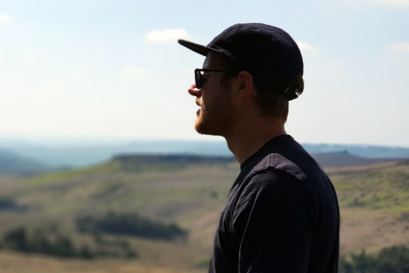
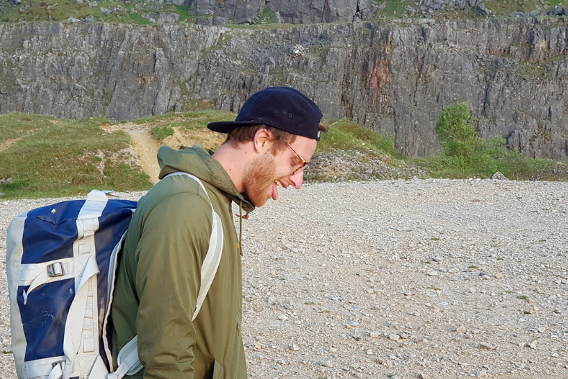
Meet Ryan French, our UX / UI Designer. In the following interview, he discusses how he fell in love with design, his first ever job and proudest project moment.
The Interview
How did you get into design?
I studied graphic products at school, which involved loads of technical drawing. So, I worked on things like nets and product packaging.
At the same time, I got to know one of my art teachers. He was really into this record label called Buzzin’ Fly Records, which signed a lot of independent electronic artists all over the world.
He showed me the record sleeves and CD covers they produced and I just loved them. They were so different from anything I’d seen before. It had a huge influence on me because I saw how different and original design could be.
So, that’s it! Technical drawing and music inspired me to chase this career.
What skills do you need to be effective in your role?
There are so many to choose from but I’ll try to narrow it down.
Patience is key because you can’t rush good design. To be successful, you have to research tasks thoroughly before starting. This groundwork makes the whole process much easier even if becomes a bit slower.
You need a willingness to learn because this industry is fast-paced and changes constantly.
Good designers are great communicators. It’s essential to listen to clients and work together to solve the problem.
Then, there’s attention to detail. It’s critical to know how each small website element feeds into the bigger picture and overall user experience.

What do you love about your job? What’s difficult?
I love the variety! Every day is different and presents new challenges. This unpredictability means I’m constantly learning about new processes and trends.
But the best thing is the positive impact my work has on a client’s business. Seeing tangible results is very rewarding, whether that’s more site visitors or an increase in sales.
What’s difficult? It can be hard when the designer/client vision doesn’t match. Sometimes, we have an idea of how a website should look or act, which doesn’t fit the client’s end vision.
Striking a compromise can be tricky – especially if people are too stuck in their ways. Again, as long as both parties communicate, there’s rarely a problem.
What’s your design pet peeve?
I can’t stand sloppy mobile design.
The percentage of mobile usage vs desktop is crazy, so we should really be making the mobile experience as interesting and as engaging as possible
A close second is when designers don’t use enough padding (spacing). Makes me feel uneasy!
What are you learning right now?
I’m always dipping into UI animation, delightful micro animations and animations that make the experience easier for the user.
What project are you most proud of?
It’s got to be a checkout redesign I worked on for Beaverbrooks, a family run jewellers. That was a gnarly project and there was plenty to get stuck into.
We redesigned the checkout phase, included new payment and delivery options and added different thresholds for products. Despite its complexity, it was massively rewarding because the results were incredible. The new design had such a positive impact on their business.
What makes a great workplace for you?
I’m a massive music lover so I like to have a good playlist on that covers all genres. It helps me concentrate.
I like to work in a place where verbal communication is encouraged, whether that’s with clients or colleagues. Talking face-to-face or over the phone is more straightforward whereas Slack messages and emails can get confused.
What else? Snacks, comfy chairs and an area for downtime.

What was your first ever job?
In college, myself and a group of friends got jobs at Tesco. I worked on the checkout. That was pretty good fun.
What was the first thing you bought with your own money?
It might have been a CD – “Big Willie Style” by Will Smith.
Who’s someone you really admire?
I’ve got a small man crush on Jürgen Klopp.
He just looks like a great guy, always smiling and hugging his players. He demonstrates loads of amazing leadership qualities.
Do you have a surprising or unique hobby?
I’m a regular rock climber. It’s really challenging and I like thinking on my feet, or with my feet!
You don’t know how you’re going to get to the top which means you have to improvise. Every move is considered and deliberate. Plus, jumping down at the end is fun. I’m a bit of an adrenaline junkie.
I climb indoors and outdoors. Climbing trips usually involve a camping element so it’s really social too.

What’s something you want to do in the next year that you’ve never done before?
Get a puppy.
What’s the best place you’ve ever visited?
I just got back from Lake Tahoe, which was incredible.
Also, I can’t stop thinking about the antique shops around here. They sell some fascinating stuff.
How do you like your eggs?
Haribo fried!
Ryan French’s Top Resources
Want to be a successful designer? Then take a look at Ryan’s favourite learning resources below.
Sidebar: Since 2012, Sidebar has been collecting the best links about UI design, typography, CSS, user research, and all other facets of design.
DesignBetter.co: Introducing the best practices, stories, and insights from the world’s top design leaders. Loaded with in-depth books, podcasts, and more,
siteInspire: siteInspire is a showcase of the finest web and interactive design.
klikkenthéke: A neue web design catalogue, initiated as a personal project by the design ateliér division binaural. A source of inspiration for designers developers and html enthusiasts.
Brutalist Websites: In its ruggedness and lack of concern to look comfortable or easy, Brutalism can be seen as a reaction by a younger generation to the lightness, optimism, and frivolity of today’s web design.

Related articles
Interviews
Learning and development with Blake Henegan
Interviews
How to create extraordinary videos with Tony Slater
Interviews
The world of wedding photography with Lee Allison